Dive into the Faena Universe. Discover what’s new in events, entertainment, dining, wellness, and retail across our vibrant Faena Districts worldwide. Journey through immersive stories and meet the people and personalities who bring each experience to life.
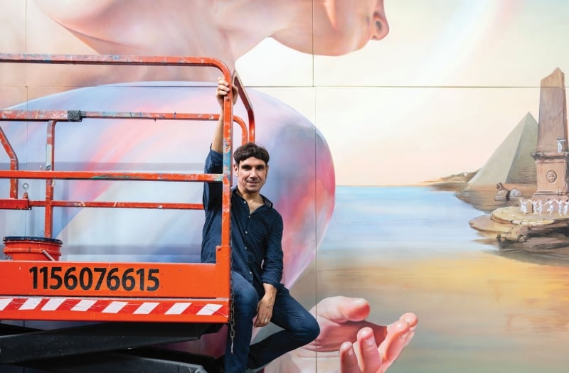
Diego Gravinese, acclaimed Argentine artist, is known for hyperrealist works that merge reality with surreal narratives - see his mural in The Cathedral of Faena New York, commissioned by Faena Art.
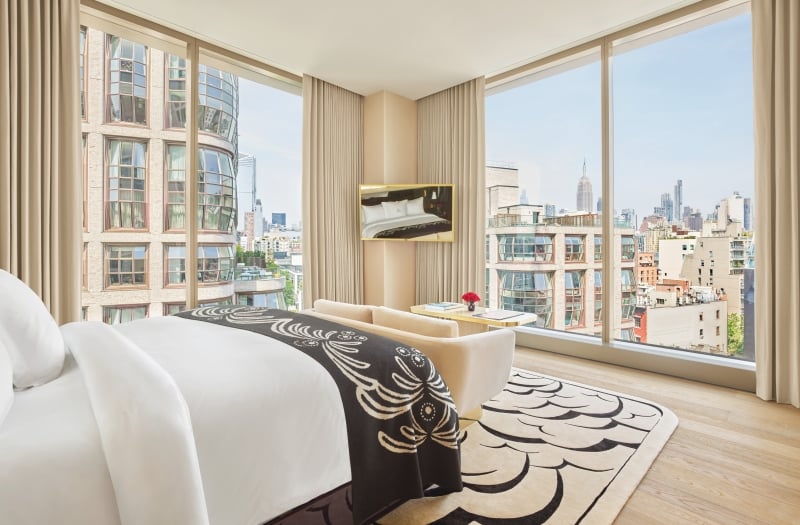
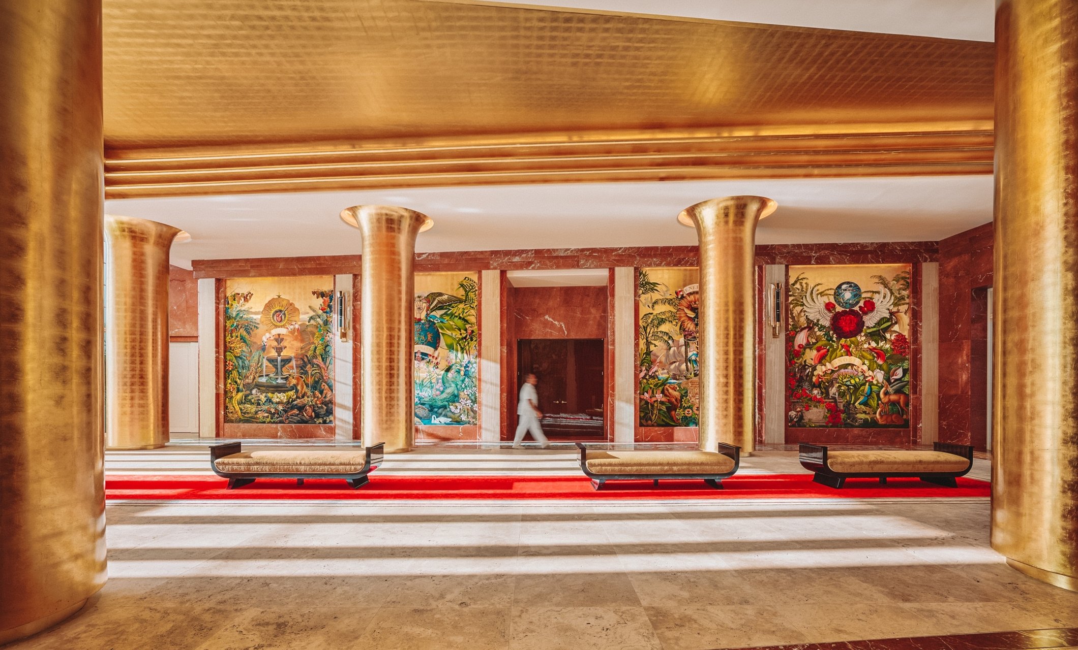
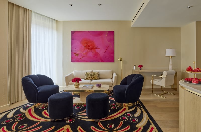
Faena New York will elevate New York City’s High Line to new heights when it opens its doors this August.
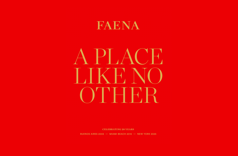
For over twenty years, Faena has transformed overlooked places into cultural destinations rooted in art, architecture, and community. From Buenos Aires to Miami Beach and now New York, each chapter is guided by a singular vision: to create emotion, inspire connection, and bring new life to the cities we touch.

La Mirada is an immersive installation composed of hundreds of digitally isolated and redrawn eyes taken from classical paintings spanning the Renaissance to the 20th century.
A vibrant interplay of color, form, and emotion
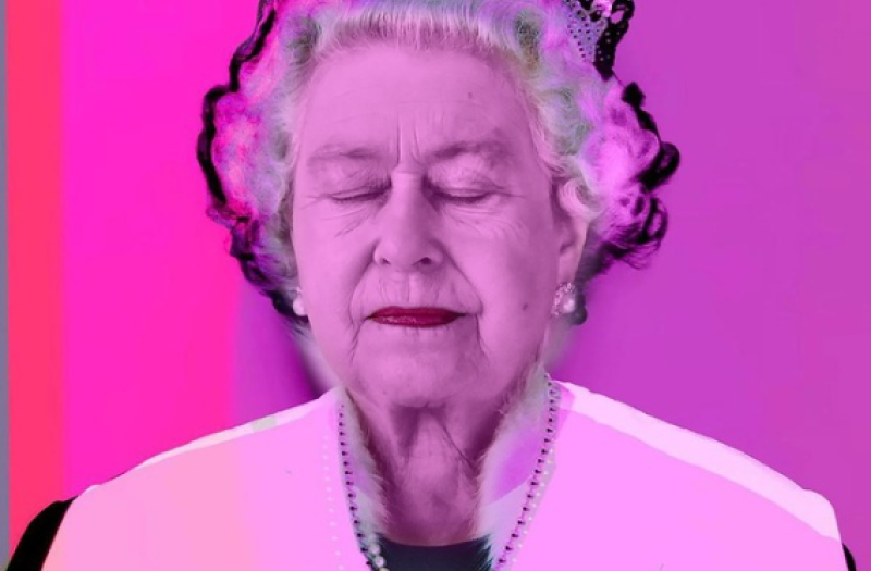
In a new series of works by Cynthia Cohen, Suspended Universes appeals to our curiosity, intuition and a sense of playfulness.
In a new series of works by Cynthia Cohen, Suspended Universes appeals to our curiosity, intuition and a sense of playfulness.
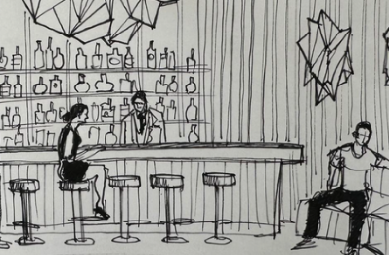
El Secreto is the precious jewel of Faena New York, a hidden salon and exclusive bar, quietly concealed behind an unmarked door on the hotel’s second floor. This intimate speakeasy evokes mystery and indulgence in equal measure creating an atmosphere of opulence, seduction, and discovery.
Journal entries are intended for editorial and informational purposes only. Offers, services, and pricing referenced may no longer be available. For the most current resort experiences and offerings, we invite you to contact our team directly.